
Resistance in the Manner of Thoreau—ready to typeset!
¶ There’s never just one thing at a time going on here in the printshop. Some jobs arrive on my desk and get designed and produced in a short matter of time—like the event invitation I designed, cast and proofed on the weekend and will print for a client later this week when the paper turns up, or like the posters I designed and printed for the Thomas Fisher Rare Book Library at the University of Toronto last week. Other projects, especially my own publishing projects, geminate (or fester, or meander—pick a metaphor) for years before they ever really start to look like much of anything at all.
This morning I brought one of the limited edition book publishing projects that has been on my docket for a few years now to a point where it has started to feel real. Resistance in the Manner of Thoreau (an essay by Jeffrey S. Cramer with prints by Amos Paul Kennedy, Jr.) has been creeping forward all this time, but today Jeff Cramer and I arrived at what we feel will be the ‘fair copy’ of the text—the edited and proofed version that I will use to composing the metal type. It’s exciting.
After considering various other approaches, I’ve decided to typeset the book in 14 point Linotype Fairfield. The next step in the project will be to compose and proof some trial pages. Digital typefaces and design software are great tools for sketching out designs for letterpress composition, but they are by no means in a 1:1 relationship with each other and there is no replacement for real ink rolling onto real type and getting impressed into real paper if you want to see whether your plan is going to work. It’s absolutely possible that I’ll cast a few pages, pull proofs and then change my mind for some aesthetic or technical reason. But it’s exciting to have a theory to test.
For those who are interested in the behind the scenes planning these kinds of projects, here’s the skeleton of what I’ve got worked out for this title. Any of it could change, of course.
7.5 × 11 inches
Edition of <100
Set in 14 point Linotype Fairfield (and wood type)
24 pages plus doubled endpapers
Printed 2-up, nested as 12 page sections, 2 sigs plus endpapers: [8] + 12 + 12 + [8]
Text paper is 130 gsm Hahnemühle Bugra “White”
Doubled endpapers are 130 gsm Hahnemühle Bugra “Brown”
Handsewn
Binding is cloth spine with printed paper over boards
Enclosure for Kennedy’s prints
Clamshell box to house book and prints
I have this book listed as a spring 2027 release, but if everything goes smoothly I may have copies available in late 2026 or early 2027. You can reserve a copy (with no obligation) by going to the New Work page of this website and scrolling down to the entry for Resistance in the Manner of Thoreau.
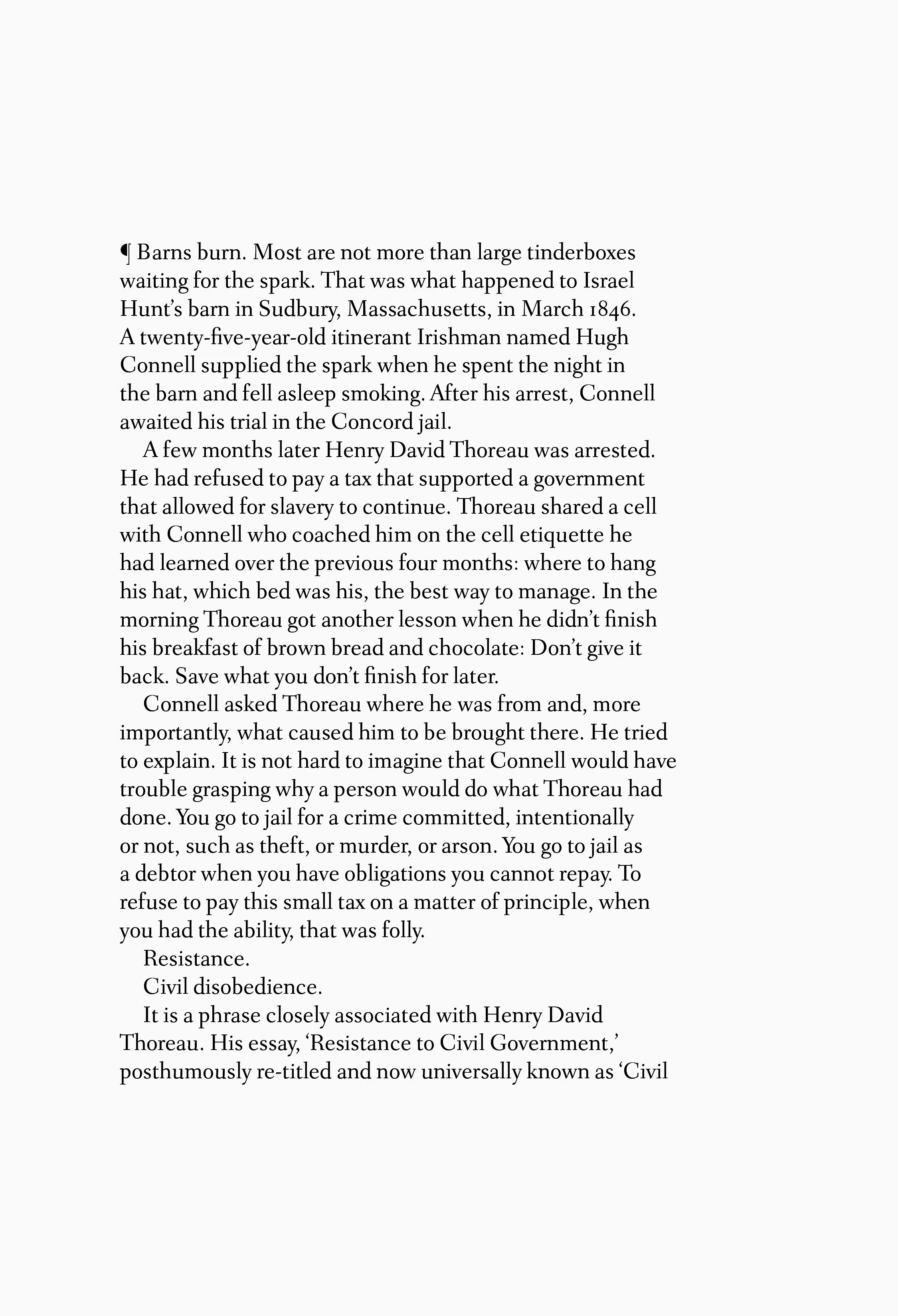
A digital mock-up of the opening page of Cramer’s essay
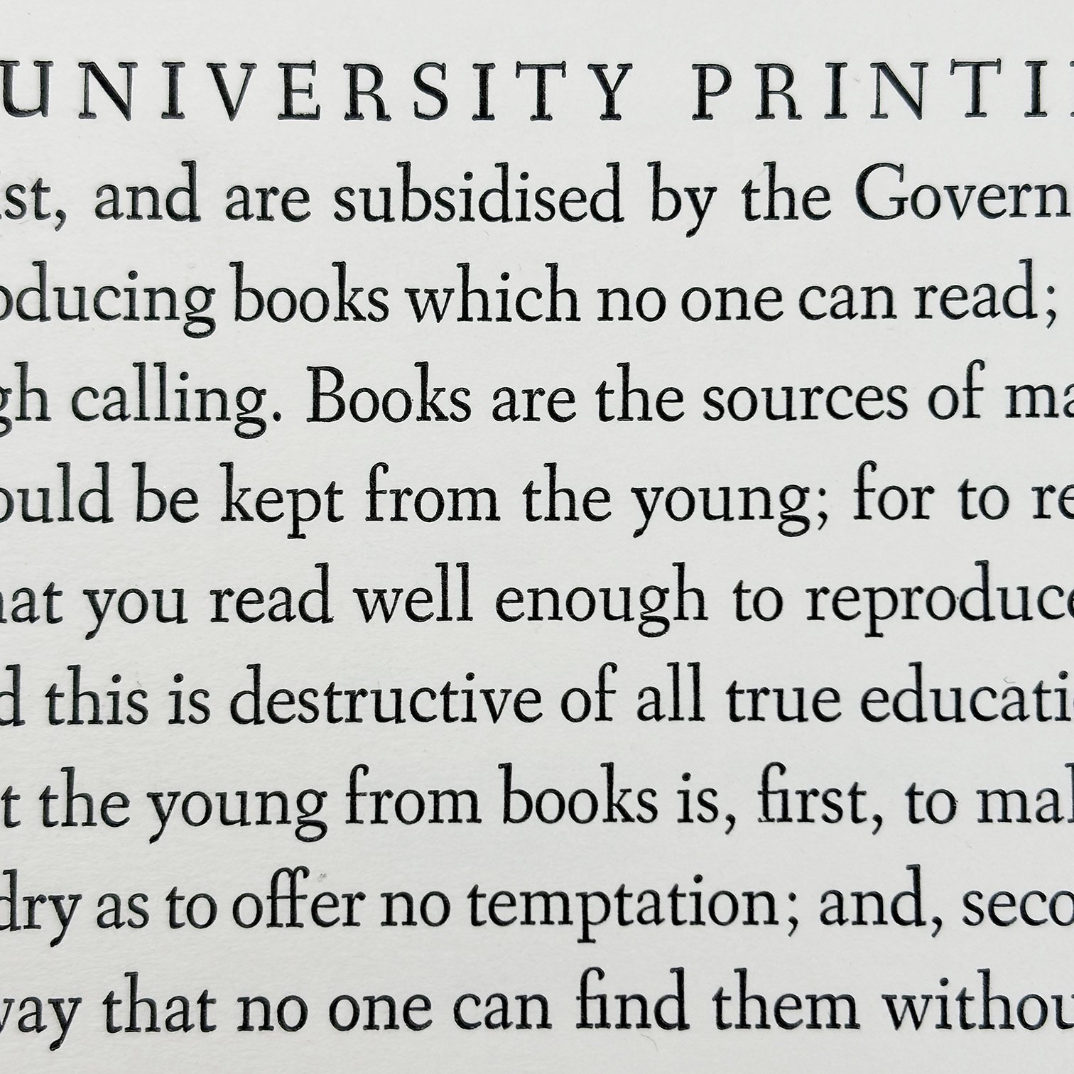
A proof of 14 point Linotype Fairfield printed from metal, from a previous job
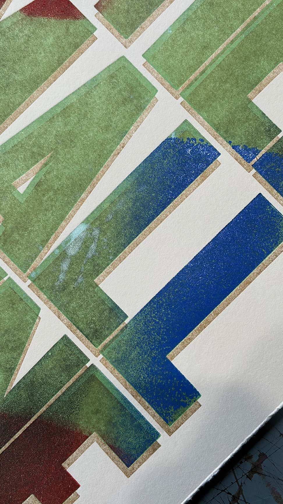
Detail from a poster printed for the Thomas Fisher Rare Book Library at the University of Toronto
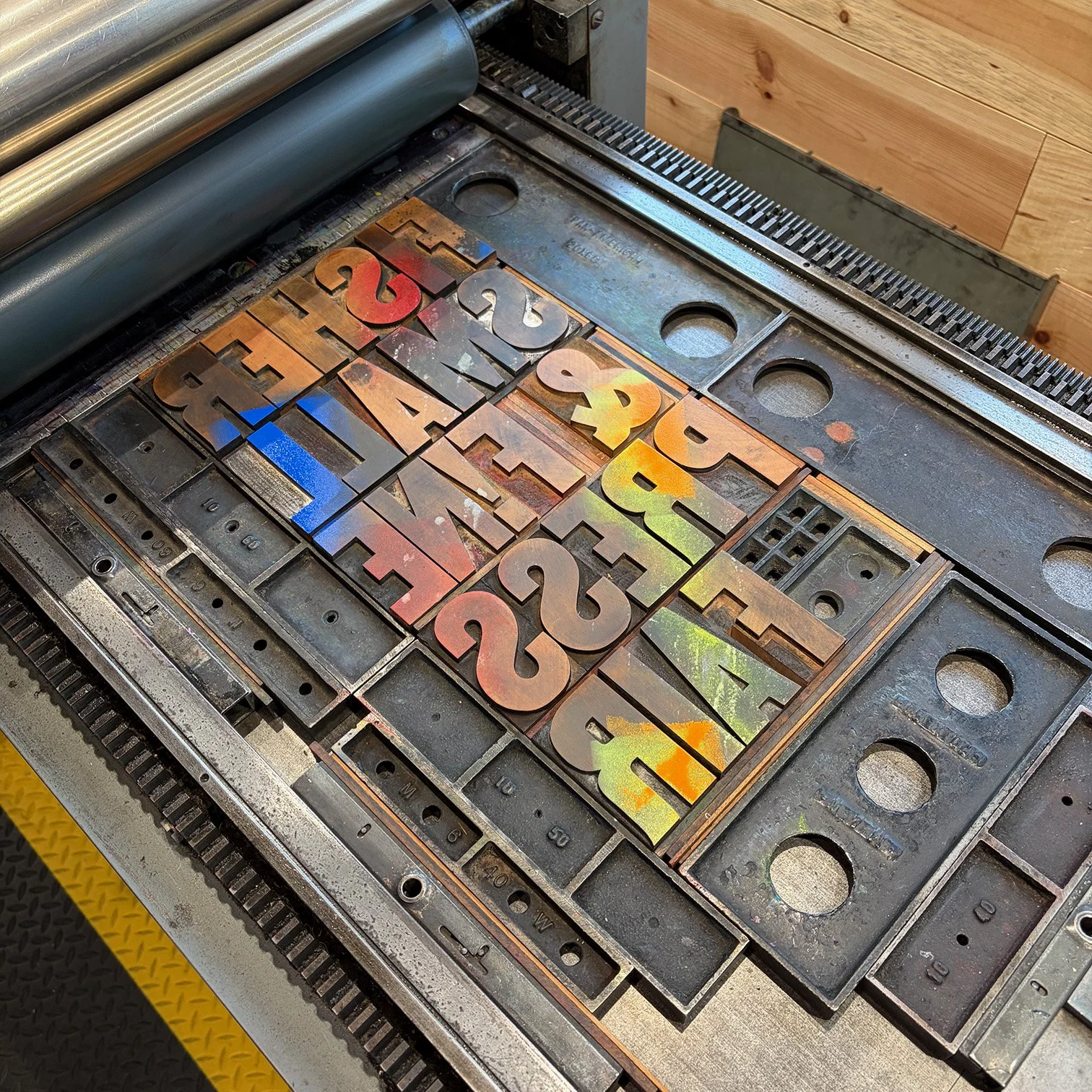
Wood type on the Vandercook Universal 1