Notes
¶ A miscellany of information about the Proprietor, the Press and its mission, the gear that’s used and the making of this website.
The Proprietor
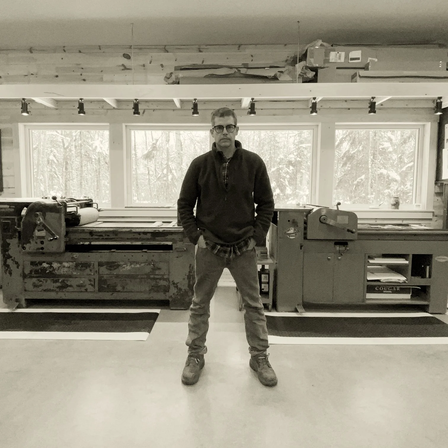
Andrew Steeves is a writer, editor, typographer and letterpress printer and sole proprietor of the Press of the Varying Hare. For nearly three decades he was the creative force behind the literary publishing house Gaspereau Press, where he designed hundreds of trade books, exhibition catalogues and other print materials using contemporary digital tools, and designed and printed limited-edition letterpress books and broadsides using wood and metal type. He received 54 awards for excellence in Canadian book design from the Alcuin Society before ‘retiring’ from the competition in 2016 to make way for emerging designers. He has also designed numerous journals and magazines, including Atlantic Geology, The Nova Scotia Policy Review and the international ‘fine press’ journal Parenthesis for which he was the North American designer from 2008 to 2020. Works from his exuberant 150-print wood type catalogue Literarum Ex Arboribus (2020) were the subject of a 2022 solo exhibition, Wood Type, mounted by the Beaverbrook Art Gallery in Fredericton, New Brunswick. In 2021, he was the winner of the Lieutenant Governor of Nova Scotia Masterworks Arts Award for designing and printing the letterpress limited-edition book Lagomorph, an honour shared with the book’s author Alexander MacLeod. Since 2025 he has produced letterpress books under the imprint Press of the Varying Hare.

The Press
The Press of the Varying Hare was established in 2025 in the rural community of Black River Lake, Nova Scotia, located about twenty minutes outside Wolfville on the South Mountain of the Annapolis Valley. The Press employs twentieth-century letterpress printing tools and techniques to create high-quality books, chapbooks and broadsides. Following the trail blazed by artist-publishers like Kim Merker (Windhover Press in Iowa) and Gray Zeitz (Larkspur Press in Kentucky), the Press of the Varying Hare aims to occupy the ground between fine press and trade publishing, its offerings ranging from more affordable letterpress-printed chapbooks and broadsides showcasing contemporary writers through to elaborate letterpress-printed books produced with handmade and mouldmade papers and handbound in limited editions.
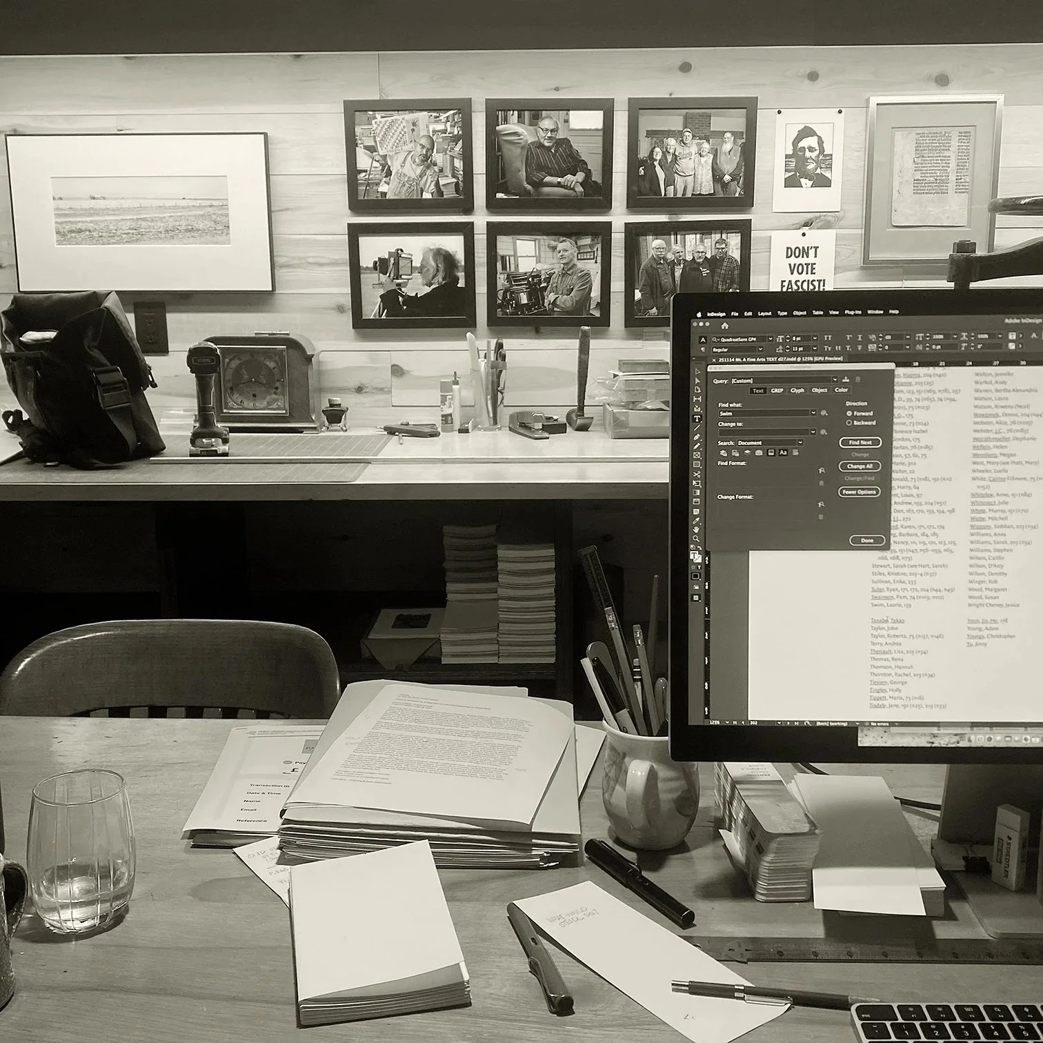
The Press also uses surplus production capacity to offer a range of design and production services to clients. These projects typically focus on typography, whether they be digitally-typeset projects destined to be printed elsewhere or letterpress projects designed and printed entirely in-house.

The Gear
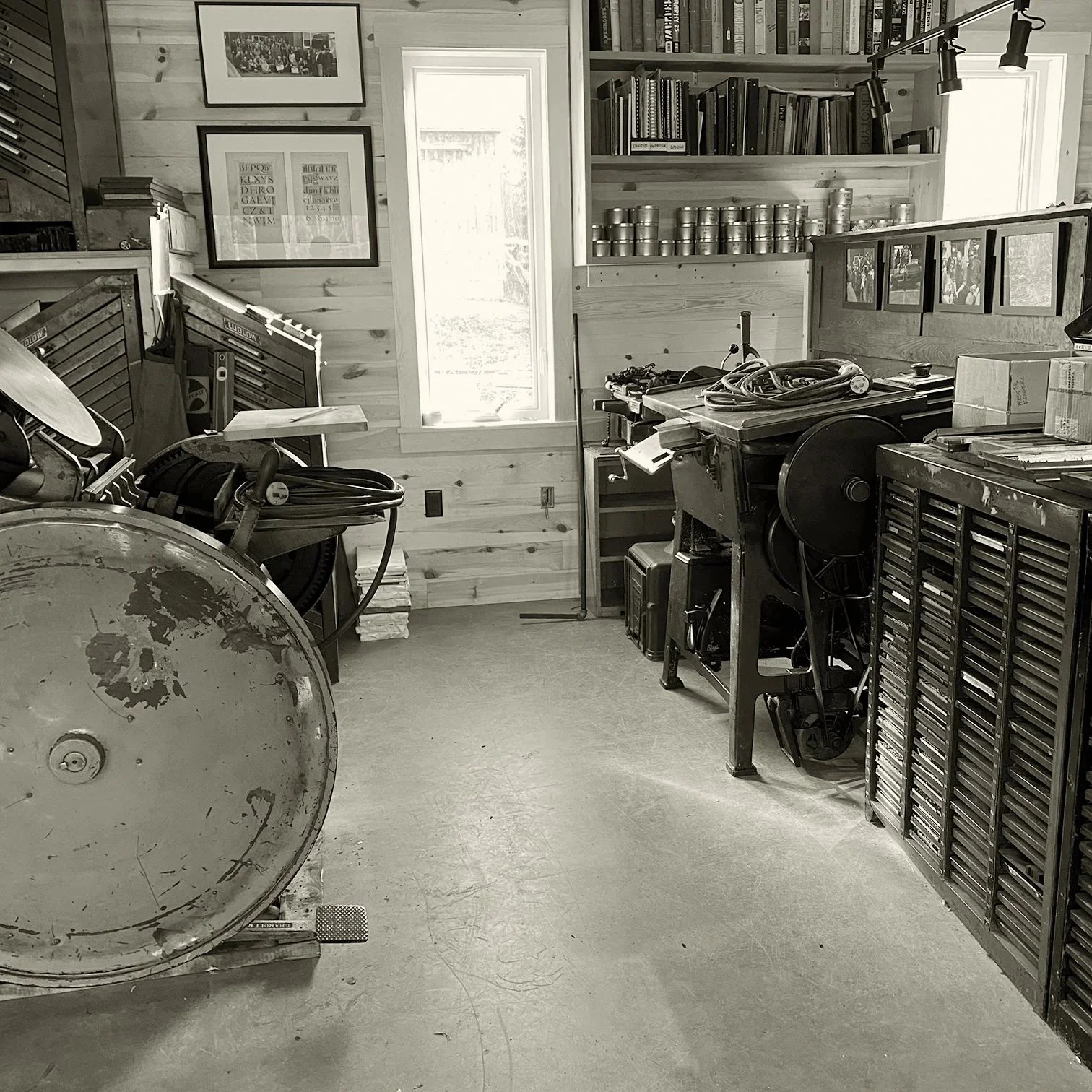
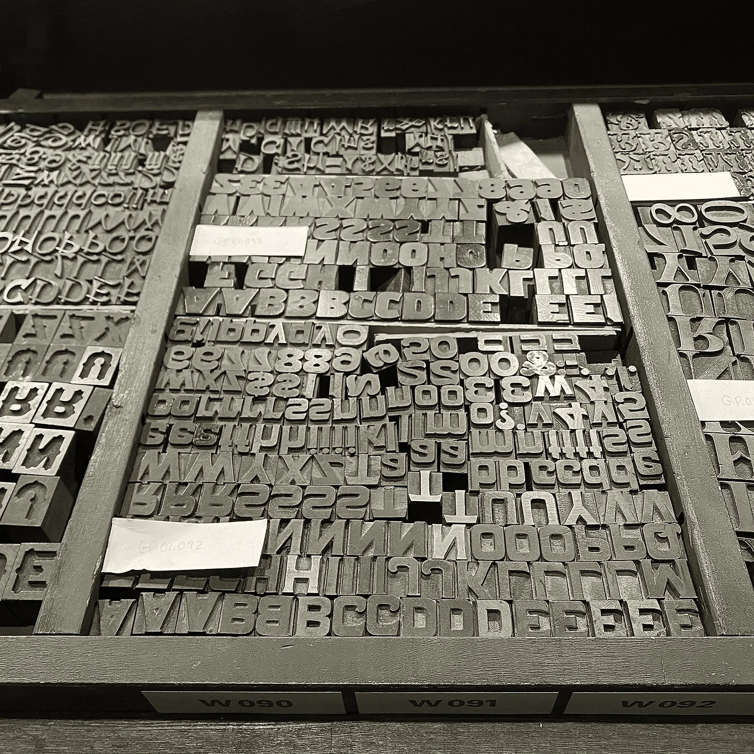
Works produced at the Press of the Varying Hare are almost exclusively printed from traditional typographic surfaces—wood and metal type. The collection includes over 150 different fonts of wood type and hundreds of cases of metal type. The Press employs two early-twentieth-century mechanized typecasting systems to create fresh type from molten metal—the Linotype (for text composition up to about 14 point size) and the Ludlow Typograph (for display sizes). Here are just a few highlights from the type and type matrix collection:
Metal type for hand composition: Albertus, American Uncial, Baskerville, Bodoni Ultra, Bradley ornaments, Broadway, Cancelleresa Bastarda, Carolus, Caslon Old Style, Castellar, Centaur, Codex, Dante, Dartmouth Initials, Delphin, Elizabeth, Floriated Capitals, Fournier Ornamented, Forum, Fry’s Ornamented, Garamond, Garamont, Gill Sans Bold, Glint, Goudy Bible, Goudy Heavy, Goudy Thirty, Hadriano, Helvetica, Helvetica Outline, Hoursneeletter, Janson, Jessen Schrift, Joanna, Juliana Oldstyle, Kapitalen Open, Lombardic, Lutetia, Menhart Roman, Neuland, Optima, Palatino, Perpetua Titling, Romanée, Samson Uncial, Saphire, Spectrum, Stern, Times, Trump Medieval, Unciala, Univers, Valiant, Venus Extra Bold, Weiss, Wilhelm Klingspor-Schrift and more.
Linotype composition: Aldus, Baskerville, Caslon 137, Electra, Fairfield, Falcon, Intertype Garamond, Garamond No. 3, Janson, Juliana, Melior, Metro Black, Optima, Palatino, Sabon, Spartan, Trade Gothic Extra Condensed, Trajanus, Trump Medieval, Walbaum and more.
Ludlow composition: Bodoni Modern, Bodoni Trueface, Chelt, Coronet, Eusebius, Florentine Script, Franklin Gothic, Garamond, Goudy, Hauser Script, Karnak, Lining Plate Gothic, Old English, Record Gothic, Tempo, Tempo, Tempo … and more.
The Press employs a variety of twentieth-century letterpress printing presses including a Vandercook Universal I AB cylinder proof press, a Vandercook 219, a 10×15 Chandler & Price platen and a 10×15 Heidelberg T ‘windmill’ automatic platen.
Most of the folding, sewing and binding work is done by hand.
The gear used at the Press of the Varying Hare has come from numerous sources. By far the largest and most significant part of the collection came from the shop of Glenn Goluska when he died in 2011; Goluska issued work under the imprints Imprimerie Dromadaire and Nightshade Press, starting in Toronto in the early 1980s and later in Montreal. Other important acquisitions were made from Michael Macklem’s Oberon Press in Ottawa, Ontario, and William Rueter’s Aliquando Press in Dundas, Ontario. Some gear came from commercial printshops in the Maritime provinces, such as Mitchell Print and Halcraft Printing in Halifax, Nova Scotia, and Centennial Printing in Saint John, New Brunswick, but many fonts of Linotype matrices were found in far-away shops located in places like New York City, North Carolina and Ohio.

The Colophon
I created this website using Squarespace’s website builder. The pressmark depicting a varying hare is from a wood engraving made by George Walker. Unless otherwise indicated, all content on this site was written or created by me (Andrew Steeves). The serifed typeface used is Rod McDonald’s Goluska, a tribute to the typographer, book designer and letterpress printer Glenn Goluska (1947–2011). Glenn was an enthusiast of the Linotype machine and of the twentieth-century typefaces designed for the Linotype by W.A. Dwiggins. McDonald’s digital typeface distills much of the flavour and spirit of Dwiggins’ work without being a revival of any one particular design. The sans serif typeface is Colville, a design rooted in a collaboration between myself and Patrick Griffin. It is a tribute to the Canadian painter Alex Colville (1920–2013) and was originally developed to guide the handcutting of Alex’s headstone by Heather Lawson. Both of these types are available from Canada Type.
All text and images are protected by copyright.

